Cambium Wine
Brand design & package deesign for a new Ontario wine company.
Brand / Identity Design
Label / Logo Design
Package Design
Cambium is a smooth and beautiful short-run vintage from Ontario. We were proud to lead and advise on the brand and design.
After several conversations and deep-dives with the client, we started exploring the family history, over a glass of wine. We knew the vineyard was family-owned and operated, but I guess we hadn’t heard that key point of history we were looking for.
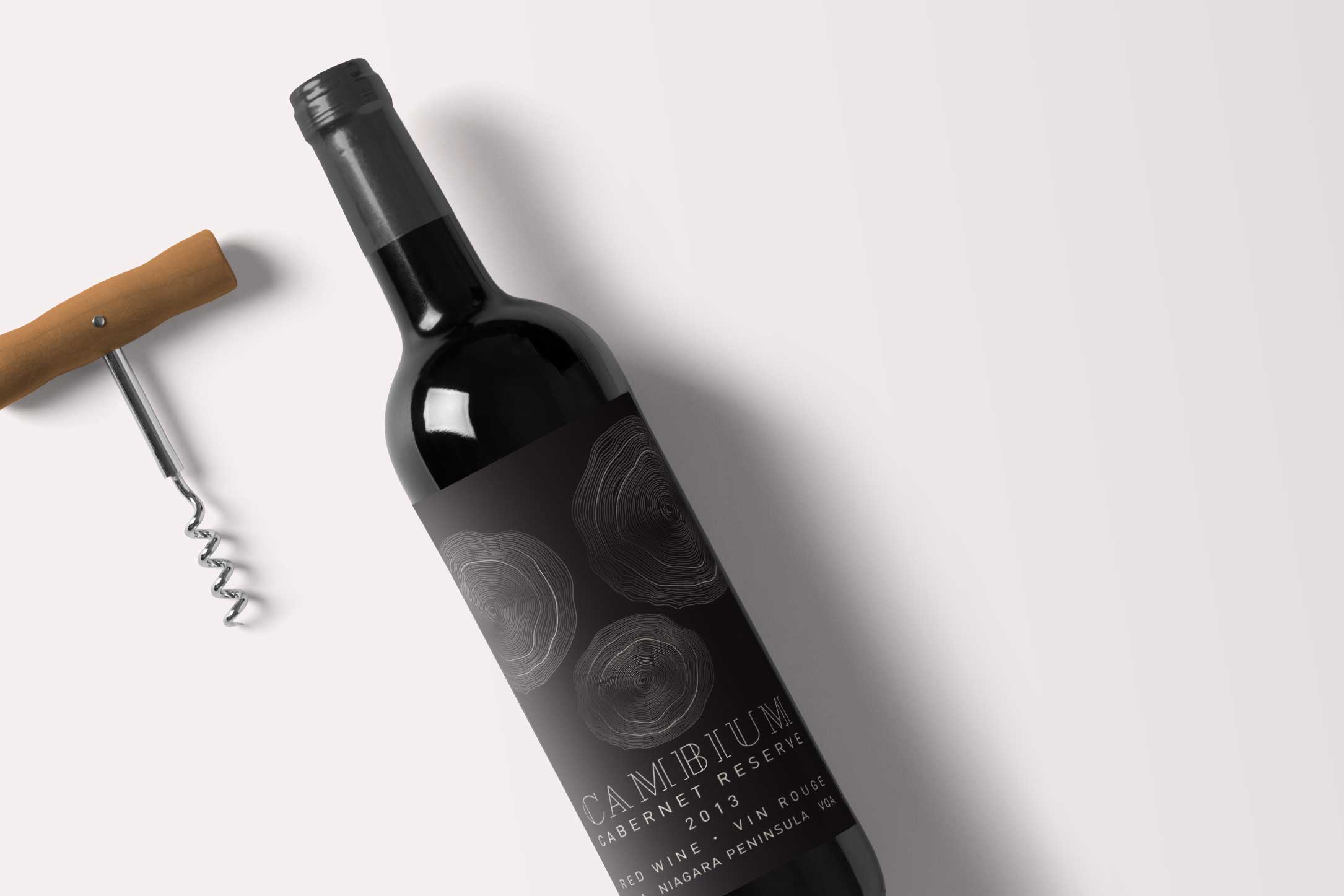
Then he hit us with it. The vineyard wasn’t purchased as a vineyard at all – it was purchased, and still used in-part to this day – like a tree farm, for the owner’s father’s landscaping business. After obtaining the farm, the Italian father planted a vine for each of his children, the vines grew. His children, one being the current owner planted a vine for each of their children also. These vines also grew.
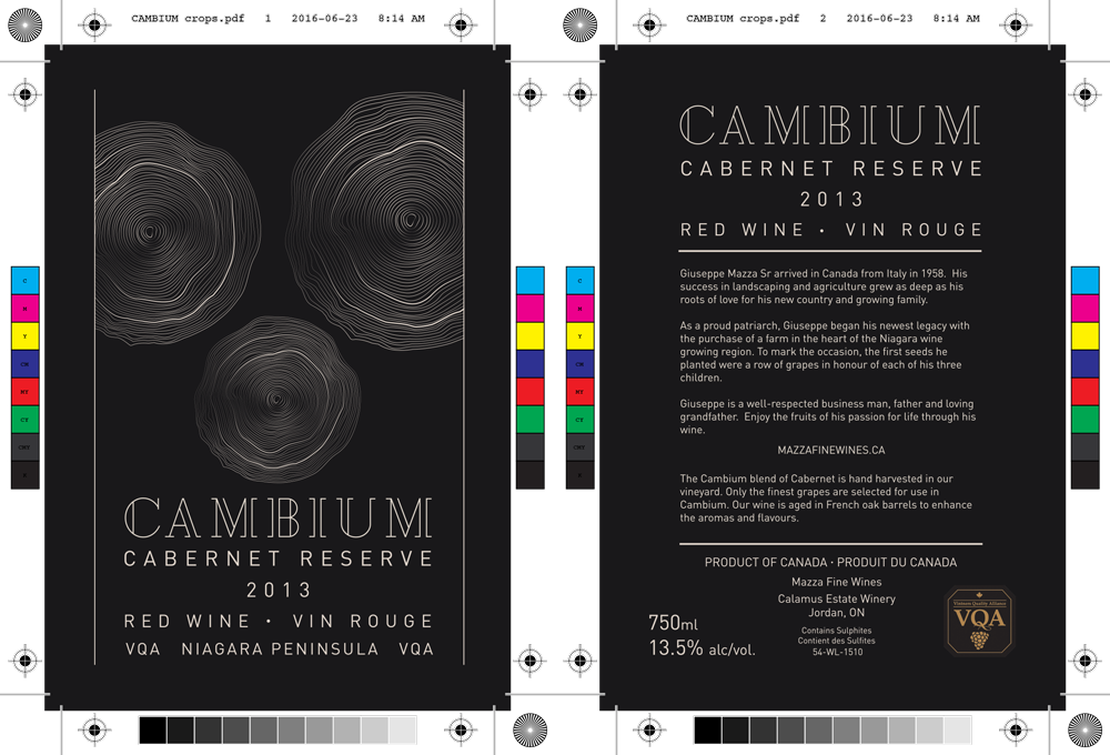
The wine is called Cambium, named for the substance between the rings of a tree, the substance that holds the tree together as it continues to grow year after year.
For more visit our blog post about this project