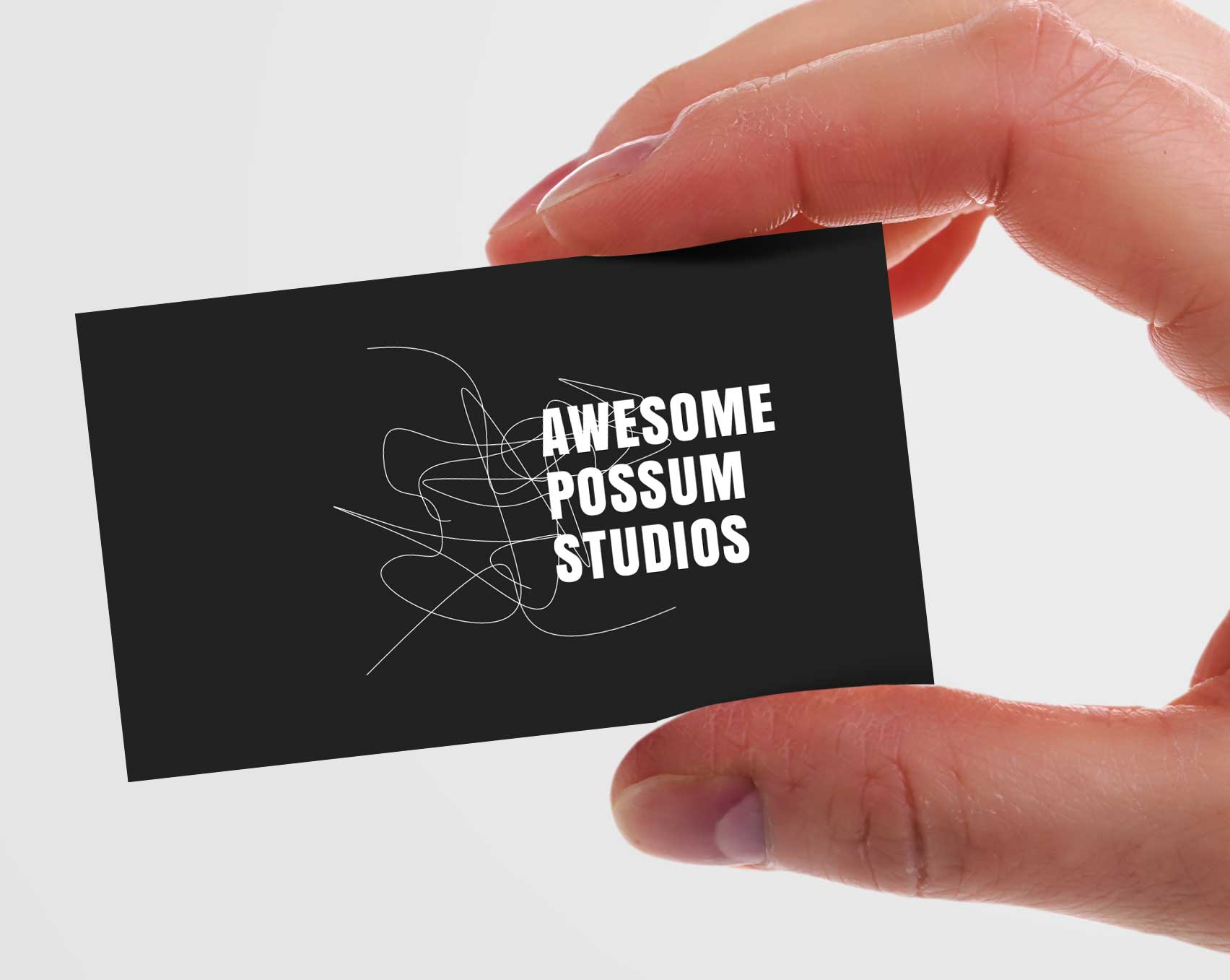
5 Tips to Design Stunning Business Cards

Back in the day (twenty or so years ago) business cards were reserved for corporations, banks and real estate firms. Nowadays business cards are not even a luxury item in the business word, it’s a standard – yet a well designed, stand-out business card can still make a really solid impression.
We put together our top five tips for designing an effective business card. Don’t want to design your own? Check out our free business card designs!
5 Business Card Design Tips by Real Designers
Consider The Size
A standard business card is 3.5″ x 2″, and there are some obvious benefits to the standardization of sizes, for one your card will fit better in most wallets and portfolios – I mean as a culture we’ve all silently agreed that the 3.5″ x 2″ is a good size and that’s totally fine. However it’s 2019 and theres nothing wrong with a little experimentation. Heed some advice and don’t go left field with the size of your card, don’t make it a hard square or a circle, but adding an extra .25″ here and there and increasing the visible space can help make an impact. When a card is a bit oversized, it also stands out more when in a pile of other cards. Consult a designer here if things start to go off track
Switch Up the Texture and the Weight
The card’s texture is a priceless business card design asset. You know how people are said to be visually inclined to like something from the first time they see it. Well, the same principle applies to the first time they feel it in their hand. Only that with a textured card, you are engaging both these senses at once.
This means that customers can create and associate more memories with your brand and will, therefore, be more likely to keep you top-of-mind and give you a call or make an order when the time is right.
This kind of leads itself to a segue into the next tip…
Consider Your Paper Stock and Finishes
This is 90% of everything when it comes to the feel of your card. The paper/card-stock determines the business card weight and texture. The weight is the actual thickness of the paper/card-stock you’re using when you go to print. The heavier the stock the thicker the paper/card. Depending on the feel you’re going for the stock can even determine the texture. If you’re going for something a little more polished you’re probably going to want to look at some finishing options – are you looking for a matte finish? glossy? something soft? Consider your brand when determining the feel of the card – in many cases you can consider this the physical sensation that will associate with your brand.
Obsess Over Typesetting
First check on your branding for your font choices. This point isn’t about font. It is however about typesetting. You have a fairly small physical space to work with so be very mindful of the way you layout information. Make sure names are extremely readable as they are the least familiar word someone is being presented with when looking at a business card. Points of contact should also be clearly readable. This doesn’t mean you can’t get creative – you should – things that stand out, stand out!
Space It Out
Very closely tied to the layout is space. Just as with any other kind of design, spacing up elements on your business card unclutters the card and gives a little more breathing space to enhance readability. However, remember you also don’t want to put in too much white space and make it seem like elements are floating all over the place. You will need to ensure that there’s a balance to ensure cohesion.
Wrapping Up
There you have it, folks! A comprehensive blog post on what you need to create stunning business cards. Be sure to leverage different colors and creative textures to come up with a better business card design.
Comments


