CALL: 855-999-1285
In today’s digital landscape, your brand is more than a logo – it’s a story waiting to be told. At Toronto Creatives, we architect comprehensive brand identities that command attention and inspire connection.
Challenge:
ZG Lantern Group, a global producer of immersive light experiences, approached Toronto Creatives seeking a complete brand transformation. They needed an identity that would reflect their evolution from traditional lantern manufacturing to creating world-class immersive entertainment experiences.
Solution:
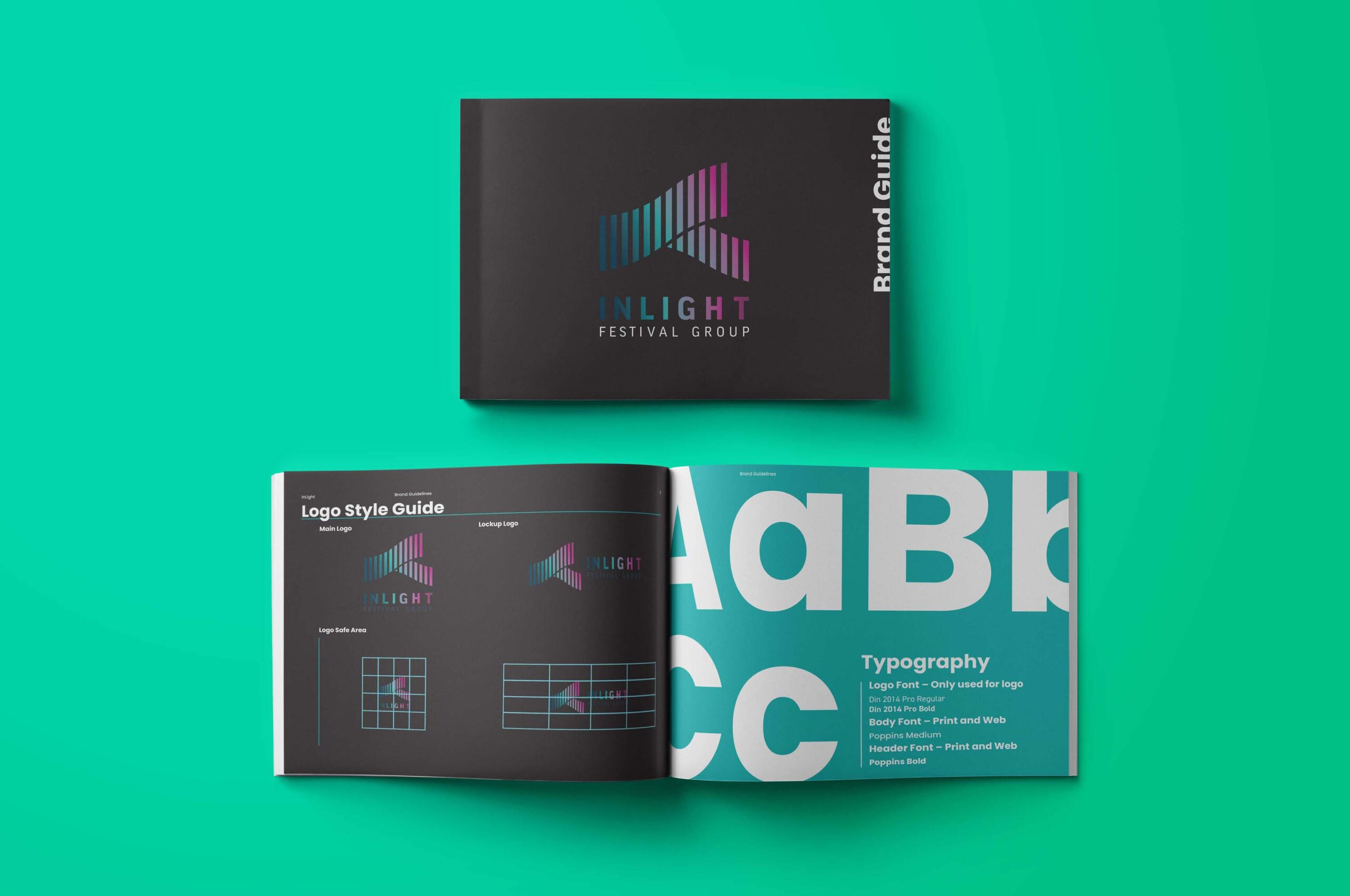
Our team developed a comprehensive rebrand, creating InLight Festival Group – a name and identity that captures the essence of their innovative approach to experiential entertainment. Inspired by the largest most natural light show in the world, the Aurora Borealis.
The branding package included:
• Strategic name development
• Visual identity system
• Custom website design
• Brand narrative development
• Marketing collateral suite
Impact:
The new brand identity positioned InLight Festival Group as a premier producer of immersive experiences, elevating their presence in the global entertainment industry. Today, they create over 50 spectacular shows annually across 20 countries, partnering with prestigious venues from Longleat Safari Park to major zoos worldwide.
The rebranding helped InLight transition from a traditional manufacturer to a recognized leader in experiential entertainment, setting the foundation for their expansion into major North American and European markets.
Services Delivered:
• Brand Strategy
• Naming
• Logo Design
• Website Development
• Visual Identity System
• Brand Guidelines
Challenge:
Cerise Fine Catering, a partnership between the prestigious Windsor Arms Hotel and Centerplate (a Sodexo company), approached Toronto Creatives for a complete brand creation – starting from the ground up with logo design. They needed a sophisticated visual identity that would honor their French-inspired name (“Cerise” meaning cherry in French) while establishing their presence in Toronto’s luxury catering market.
Solution:
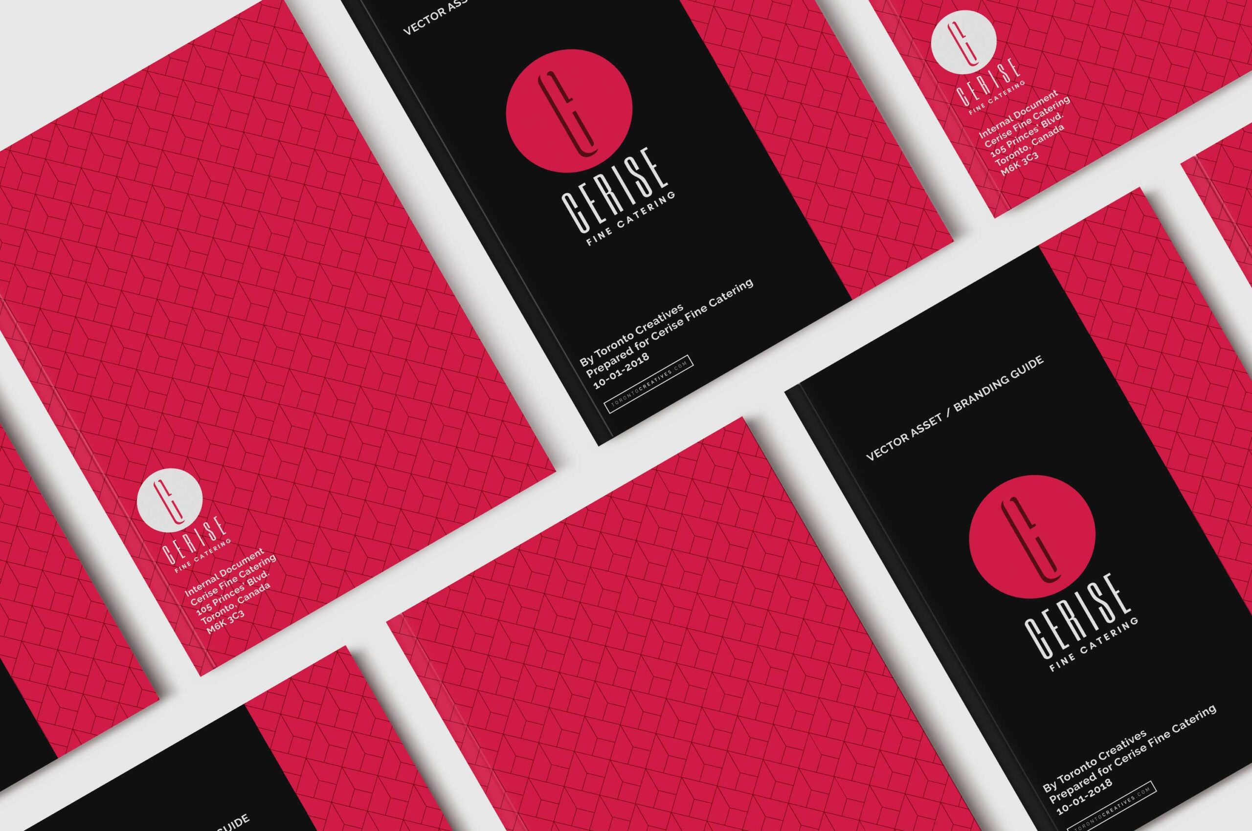
Toronto Creatives developed an elegant brand identity beginning with a thoughtfully crafted logo that drew inspiration from the company’s French name:
Logo & Visual Identity:
• Custom logo design inspired by the sophistication of French cuisine and the elegance of cherries
• Refined color palette drawing from deep cherry tones
• Typography selection reflecting both luxury and approachability
• Versatile logo system for various applications
Digital Presence:
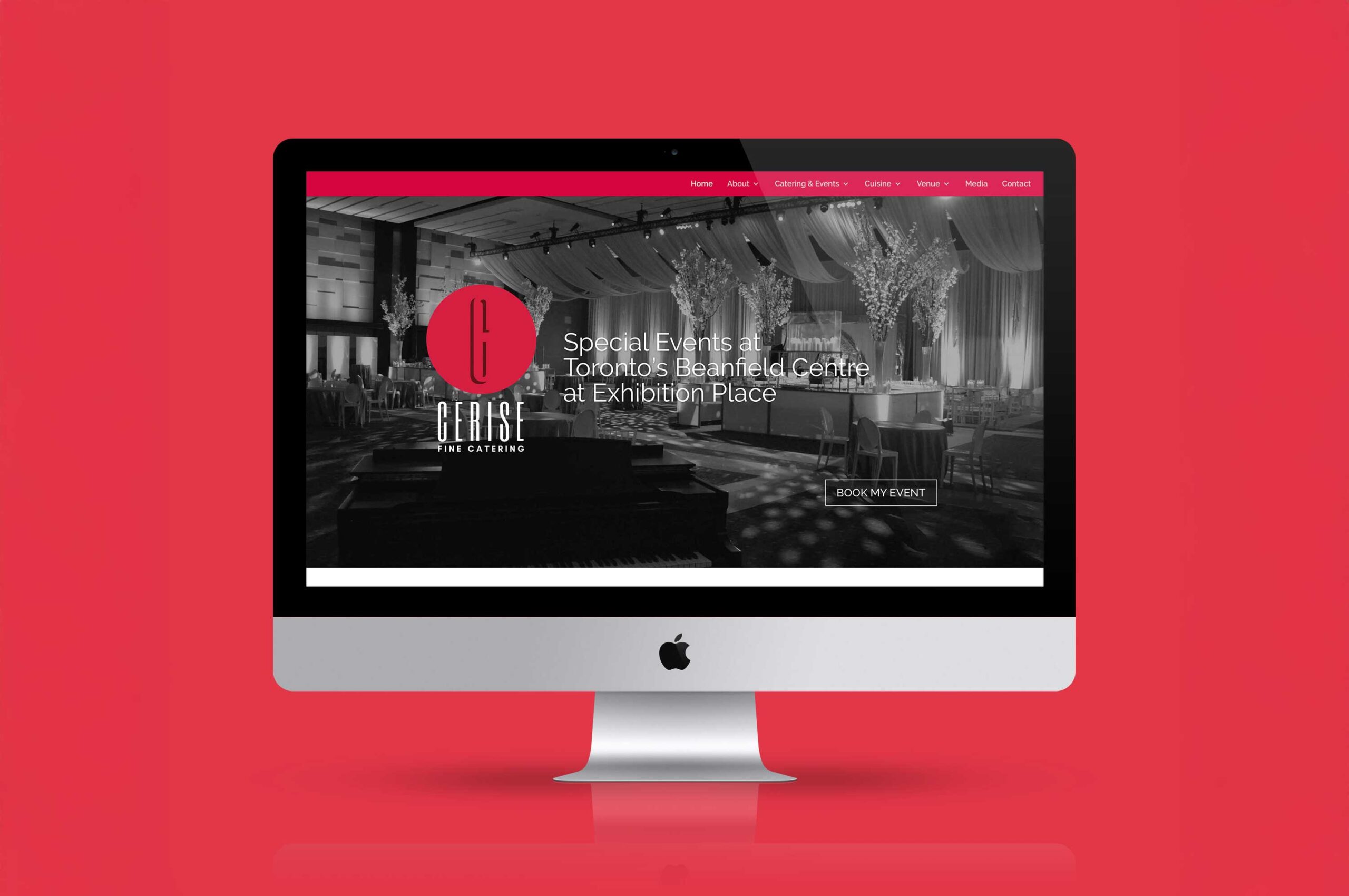
• Custom WordPress website with builder integration
• Interactive menu showcasing system
• Responsive design optimized for all devices
• Seamless booking and inquiry functionality
• Rich media integration for culinary showcases
Menu Design System:
• Extensive banquet menu design incorporating the cherry-inspired brand elements
• Custom menu typography and layout
• Cohesive visual system across all menu categories
• Premium print production specifications
• Flexible format for seasonal updates
Impact:
• Established a memorable visual identity rooted in meaningful symbolism
• Created instant brand recognition through the cherry-inspired design
• Increased online inquiries through the new website
• Streamlined menu presentation process
• Enhanced client experience through cohesive branded touchpoints
• Strengthened market position in luxury catering
Services Delivered:
• Logo Design & Development
• Brand Strategy
• Visual Identity System
• Website Design & Development
• Extensive Menu Design System
• Photography Direction
• Marketing Collateral
• Brand Guidelines
CALL: 855-999-1285
Copyright 2025 Toronto Creatives


