5 Thing to Consider When Designing A Brand
We understand startups, small and medium-sized businesses because we are one. We understand budgets and taxes and all that stressful new, small or medium sized company stuff. More importantly, we understand the allure of the independent creative business person, the independence and the opportunity to create your professional reputation.
Besides your talents and amazing product, how do you want people to view you in the world today?
When contemplating a new or growing business venture, you typically think about the product you wish to sell, how best to optimize your sales/production force to maintain quality and maximize your bottom line. You have to consider your scalability, your business development, and your customer relations.
But yet, there is one component that you cannot overlook: a great Brand Design. We get asked about branding a lot so we thought we would put some tips together to talk about it.
Some tips on Great Brand Design
First and foremost let’s establish what we mean when we say brand. Branding is one of the most critical parts of your business presentation. It’s the logo, the fonts, the
It communicates your vision to your customers and your value. Branding is critical for your professional business.
A good brand design, in a moment, should give a potential client/customer an inherent idea of what your product is and what unique touch your company or product is bringing to that industry. This in no way means it needs to be overly complicated. We have a term called “brand feel” which is a loose way of describing the overall flavor of a brand, what it makes us feel, taste, feel
Brand design can gain you loyal customers or repel prospects away from your company in a matter of moments, it’s something to be considered seriously.
Before building a Brand, you must understand your area of interest.
In this article, we have provided a few essential keys to creating a great Brand design for your business. Follow these tips to gain the right customer base for your brand.
1. Classic Solutions
There are so many sources of information floating around online. You might even notice that design trends often change. We’ve seen a lot of single line design in the past few years. Minimal modernist before that. There’s something to be said for the classics.
Think less of how you want your result to be and focus more on your value proposition, the first impression you want your clients to have and the lasting impression of how your clients will think and – more importantly – feel about your brand.
Just because your branding is a classic, does not mean that it has to be dull. Many classic designs are synonymous with luxury and craftsmanship. Traditional fonts and shapes are perfect for a brand that will stand the test of time.

2. Fonts
There’s a rule about using no more than three fonts in a brand design – we like to scale it back to two fonts in a whole brand – whenever possible.
We could write an incredibly long article on just Fonts. We absolutely should and will link it here when we do! In the meantime here are a few quick things to think about when working with fonts, in particular for use in your logo.
Serif vs. Sans-Serif: A serif is the little accents or points you see along the corners of letters, this is a common trait in many classical fonts. A typical example of a serif font would we Times New Roman or Garamond.

Here are those fonts with the serifs noted.

A serif font has a classic look and is typically regarded as communicating something to consider, like looking at abstraction or an art piece. We’re most often exposed to these types of fonts when absorbing information for recreation or education. They are often found in both fiction and non-fiction books and novels as well as full-on textbooks. This style of font is read as something with substance. Something to learn.
The two examples below are Helvetica and Nexa Lite, both sans-serif fonts, these letters don’t have those fancy design points.

A sans-serif font is most often associated with quick, factual information like directional signage, use instructions or public documents. This has its own set of benefits in that this font can provide high-impact communications quickly, it’s more visible but less connectable.
There are thousands of things to consider with font choices…
Should you use a custom font? A custom font can not only make a huge visual statement, allowing it to stand out as well as add significant production value to the project.
3. Be Bold. Be Simple.
If you are looking for a wide audience of clients, you do not want to blend in with the crowd. While it is beneficial to check out the competition from time to time, avoid copying their design or you will just go unnoticed.
A strong logo can make a huge impact, but just because you’re trying to be different doesn’t mean you should be overly complicated. Keep your design simple and easy to reproduce in several mediums. Consider how it will translate when it’s printed on business cards, letterhead, and even t-shirts.
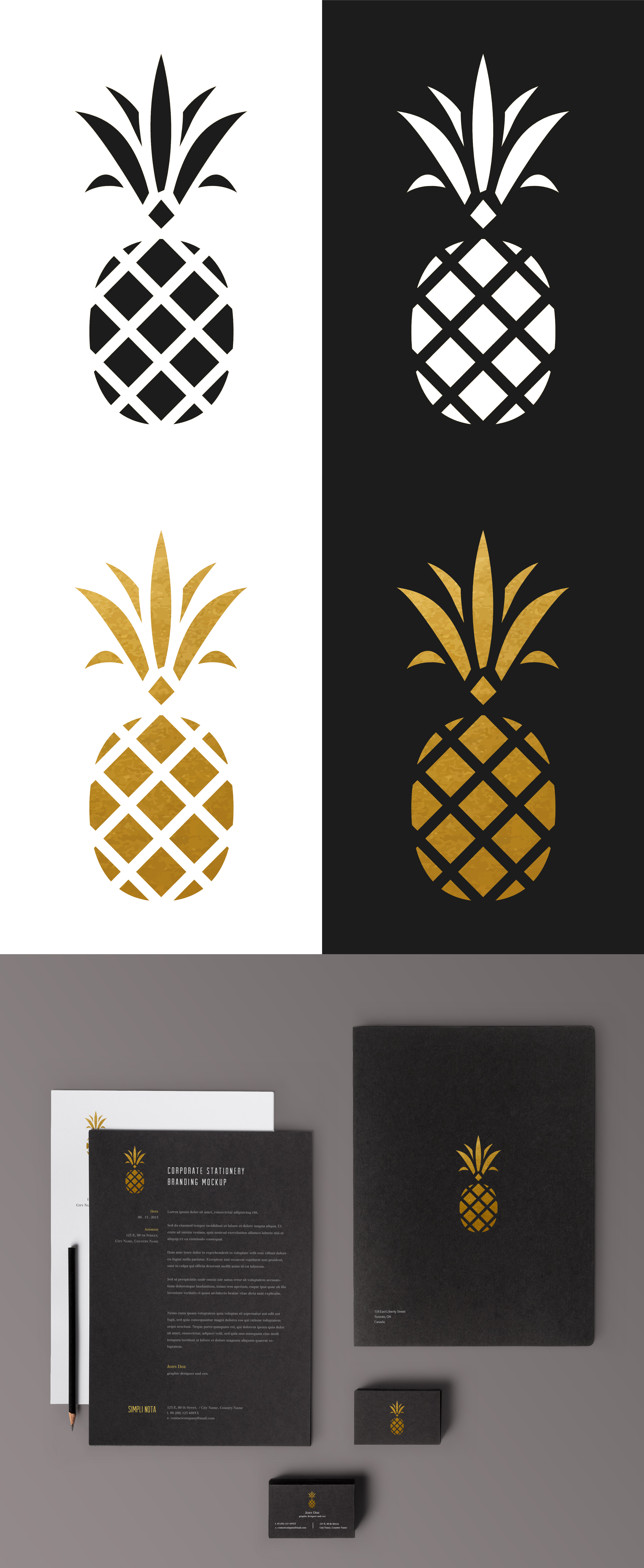
Tip: Start with solid black and white – we have a rule-of-thumb that any logo should be able to stand strong on its own – and be recognizable – in solid black and white. This helps you avoid common logo pitfalls like gradients or overly-complicated embossing. See tip five.
4. Understand Your Brand
Your brand is not your business. It’s normal for a business owner to not understand their brand. Many try to personalize it when it shouldn’t be personalized; and others distance themselves from the brand, when in fact it’s deeply personal and their business is all about them. Some owners make design choices based on personal preference rather than listening to their customers or an objective 3rd party. If an owner is too deeply mentally invested into one aspect of the business (for instance) he/she may be missing the greatest value proposition the business has to offer. This is when it’s necessary to guide you as a business owner.
Here are some things to consider when you’re trying to understand your brand and how it relates to your business.
What is my goal day-to-day?
What is my goal in five years?
What are some unique aspects of my product and services?
What should customers say about my business to their friends?
What reputation do I want to form for my company?
Why would/should a potential customer choose my product or service?
How does/should my product or service make someone feel?
5. Design Without Colour First
While brand
Bonus: Seek Customer Feedback, if Possible.
If you’re rebranding – or have an existing clientele and are considering a direction change – make sure you get customer feedback in some form or another. It is important that you study your target audience. Understand their desires and habits. What do they want that you are willing and able to provide other than what you already sell? This may be an opportunity to line up a new product or service. Why not use a re-brand to your advantage. Are they asking for another purchasing method? Or faster delivery? Maybe they are asking for directions; or looking for a solution for a particular problem within your market. A great brand should also be able to adapt, but that’s another different article.
Comments


