Maps of the Internet
Maps of the Internet
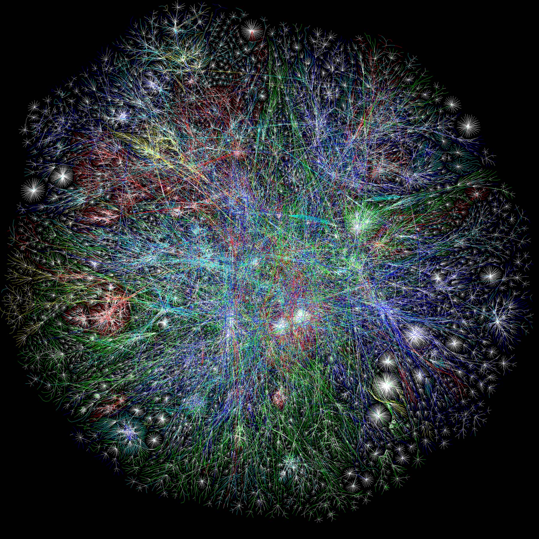
Map of the Internet circa 2003 – This image has been making it’s a way around the net since, well… 2003. I think it’s a pretty cool image; and not to mention mind-blowing as a representation. We see this stuff on Facebook or Twitter and think that sweet (or something), maybe even like, or share it. In this post, I’m going to try to get some insight into this image, where it came from, how accurate it is and what it represents and see what happens when you tear the concept of the internet map apart.
Tearing it apart is probably a harsh way to put it. I’m going to ask and try to answer a couple of questions.
- Where did this image come from?
- What does this map look like today?
- Who is on the internet right now?
Where did this image come from?
Well it turns out this image can be attributed to artist Barrett Lyon and The Opte Project.
According to the Opte website “The process starts with a BGP dump from routers, that is then processed into a relational database. The database is exported to a format called LGL, which is eventually converted into vector images. At the end of the process, we have an Image.”
The motivation for the project was brought on partly by the artist/programer’s frustration with the Internet Mapping Project of William Cheswick and Hal Burch, a project producing complicated ‘peacock maps’ of internet networks for a company called Lumeta, yet nothing half as complex as the Opte images. The frustration for the project stemmed from the proprietary process from which the maps where generated, rendering them useless to those external from the original project. Being a proponent of open-source code/processes Lyon challenged himself, and a friend for a wager of fifty bucks – to create a piece of software to map the whole internet in less than a day.
A print of this Internet map currently hangs in the MoMa (Museum of Modern Art) in New York City.
What does this map look like today?
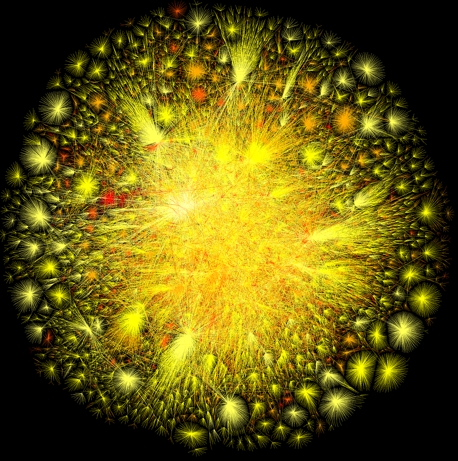
From everything I’m finding the maps need to be generated one at a time. The above one, most defiantly the print version generated in 2003, hasn’t changed. There has been a number of versions generated since, the latest in 2015, as well as the below which was generated by the project in 2010.
So the image isn’t a live representation of the internet right now. Which means I’m left back on Googles home page for an answer to my next question:
Who is on the Internet right now?
So while I’m not sure if there is a live view like this – I haven’t found one yet – I have find some neat answers to that question.
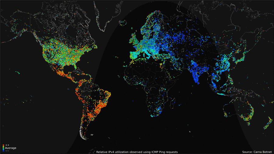
The first of which was a map created from a hack, sort-of. In 2013 HD Moor conduced his own personal census of the internet by initiating a ping on every connected device, perhaps even yours. He used a computer stack overheating in a small room. Why did he do it?
“For fun” said, Moor.
This is what everyone on the internet looked like in one day, for a moment across the world.
The second site I found here visualizes everyone using the internet right now. For the most part, when I check this, at several points today it hovered around 3.5 billion.
Comments
Advertisement

Advertisement
Advertisement
