Tea and Herbal Association of Canada
Full rebranding for Tea and Herbal Association of Canada
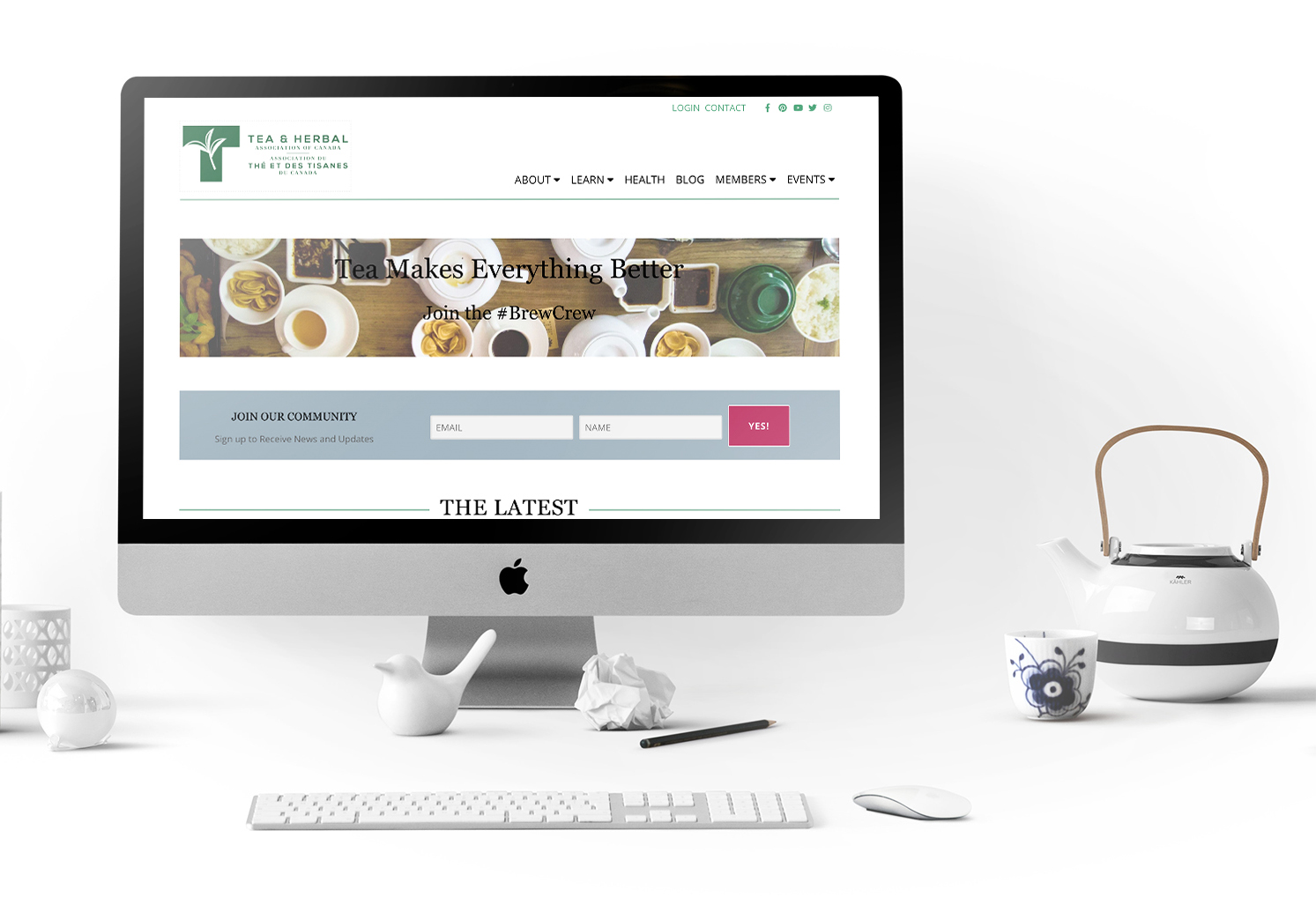
Logo Design
Quality Inspected Seal
The Tea and Herbal Association of Canada is dedicated to the highest quality standards of product quality and trade practices around the import and sale of loose leaf tea in Canada, no small task being that tea is the second most-consumed substance on Earth next to water.
Sorry coffee.
After almost thirty years with the same logo, one that’s instantly recognizable in one of the largest industries in the world, The Canadian Tea and Herbal Association was ready for a change. More specifically a branding update. The outdated logo was catching up to an industry that’s changing nowadays, after years of stagnation.
Tea is on the rise in the current world mindset. It’s a healthy and delicious alternative to soda beverages loaded with sugar, and maybe, more importantly, it is ritualistic and complicated – both heavy selling points in today’s marketplace obsessed with authenticity. After all, tea hasn’t changed very much in the last few hundred years.
When working on the updated brand design we kept in mind the current logo and asked ourselves “what about this logo, makes it the Tea and Herbal Association logo?”. We identified the most important part of the logo as the tea leaf and the second, the uppercase T itself. The importance levels of these two elements are arguable, both are extremely recognizable to the industry and the association itself.
These two elements were the constraints we gave ourselves once we hit the design floor. We experimented early on with losing the uppercase T in place with a lowercase “t” – but this route was abandoned early on in the ideation phase.
Ultimately we chose to keep both the uppercase T and the leaf. The colour was adjusted slightly from the previous logo to include 3.5% more blue, and an additional hint of grey giving the tone a cooler and more modern feel.
The fonts were chosen to represent the seriousness of the work the organization does. Tea may seem like a light-hearted subject but when it comes to a trade association who deals with companies and governments all over the world, it’s incredibly important to project professionalism and trust. This organization does, after all, represent the tea industry as a whole for Canada.
The Tea and Herbal Association of Canada is also responsible for the quality standards set for tea in Canada and thus, the final portion of this project was to design the Quality Inspected Seal that goes on all tea packaging that meets the standard the organization has set out for tea being sold to Canadian consumers.
This is also the first time in Toronto Creatives (the company’s) history that a design we’ve produced will be on multiple brand’s packaging, Nationally. Which is pretty sweet.